HIRISHA MEHTA ヒリシャ・メヘタ
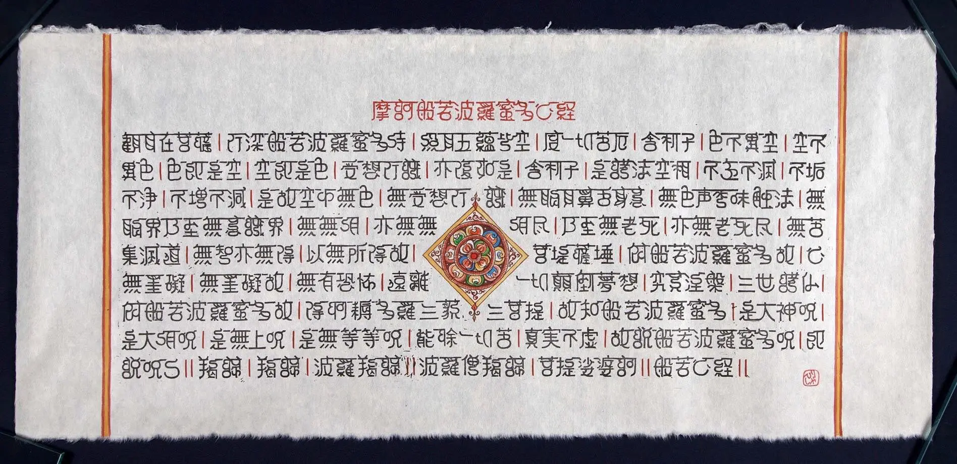
Hṛydaya Sūtram
90cm X 40cm
Hand carved print with original typeface and paint on Kurotani washi
2021
Gingko
136cm X 35cm
Pencil rubbing on washi, 2024
_____________________________
Hṛydaya Sūtram
The Heart Sūtra, known as the Maka Hara Hannyamita Shingyo in Japanese, is well-known in Buddhism and can be translated as the “Heart of the Perfection of Wisdom.” My work, Hṛydaya Sūtram, is The Heart Sūtra rendered in an originally designed Japanese typeface based on the Indian Devanagari (meaning “…as used by the Gods”) script, taking the sūtra back to its Indian roots while also making a bridge with Japan, where it is part of the culture and people’s lives.
The Devanagari script forms the bases of many Indian languages, including the Pali language, in which the Buddhists manuscripts were originally written. I believe that a language is not just a tool of communication, but also a seed of curiosity that connects people and brings cultures together. In Hṛydaya Sūtram,
the kanji of the typeface look very Indian, but remain readable. This is because ligatures are a common feature of both scripts. The Devanagari script is phonetic, where various sounds combine to form words, whereas Japanese kanji is a pictographic script, in which each character is a representation of one or a number of things, actions or ideas. Using the concept of ligatures, I have “tied” the two cultures together, bringing them closer, just as Buddhism and trade did in ancient times.
May this hand-carved, printed scroll of The Heart Sūtra with its old and new features encourage you to not only meditate on “form and emptiness,” but also give you a chance to look closely and ponder on how things as simple as shapes and form can bridge and influence cultures. Hṛydaya Sūtram is read from left to right as in Devanagari script.
日本では般若心経は、仏教において広く知られており、「智慧の完成の心」と訳すことができる。私の作品「Hṛydaya Sūtram」は、インドのデーヴァナーガリー文字(「神聖な都の文字」という意味)を基に独自にデザインした日本語の書体で般若心経を表現したもので、この経典をインドのルーツに回帰させると同時に、文化や人々の生活の一部となっている日本との架け橋となることを目指している。
デーヴァナーガリー文字は、仏教経典が元々書かれたパーリ語をはじめとする多くのインド諸語の基礎となっている。私は、言語は単なるコミュニケーションの道具ではなく、人々を結びつけ、文化を融合させる好奇心の種でもあると信じています。私の『Hrydaya Sutram』でデザインした漢字はインド風の書体でありながら、部分的デーヴァナーガリーの文字も読める。これは、合字が両方の文字体系に共通する特徴だからです。デーヴァナーガリー文字は表音文字であり、様々な音が組み合わさって単語を形成します。一方、日本語の漢字は表意文字であり、それぞれの文字が一つまたは複数の事物、行為、あるいは概念を表します。合字という概念を用いることで、私は古代における仏教と交易のように、二つの文化を「結びつけ」、より近づけようと試みました。
この手彫りの巻物に印刷された般若心経が古き良きものと新しいものが融合した独特の魅力を持ち、皆様が「色空」について瞑想するだけでなく、形や形態といった単純なものがどのように文化を結びつけ、影響を与え合うのかをじっくりと考察する機会を与えてくれるでしょう。この作品は、デーヴァナーガリー文字と同様に左から右へと読み進めます。
Gingko
136cm X 35cm
Pencil rubbing on washi, 2024
Kyoto gingko are a wonder. They are big. Of varying shapes and sizes. And each a unique piece of art completely created by nature. Even after having seen them turn colours year after year, it was first in the fall of 2019, that I completely fell in love with the gingkos. It’s textures and varying forms fascinated me. So much that I wanted to remember each and every gingko leaf. That is when I started with the pencil rubbings.
京都のイチョウは素晴らしい。大きく、形も大きさも様々。そして、どれもが自然が生み出した唯一無二の芸術作品だ。毎年色づく様子を見てきたけれど、2019年の秋、初めてイチョウに完全に魅了された。その質感と多様な形に心を奪われ、一枚一枚のイチョウの葉を記憶に留めておきたいと思った。そして、鉛筆で葉を写し取る作業を始めたのだ。
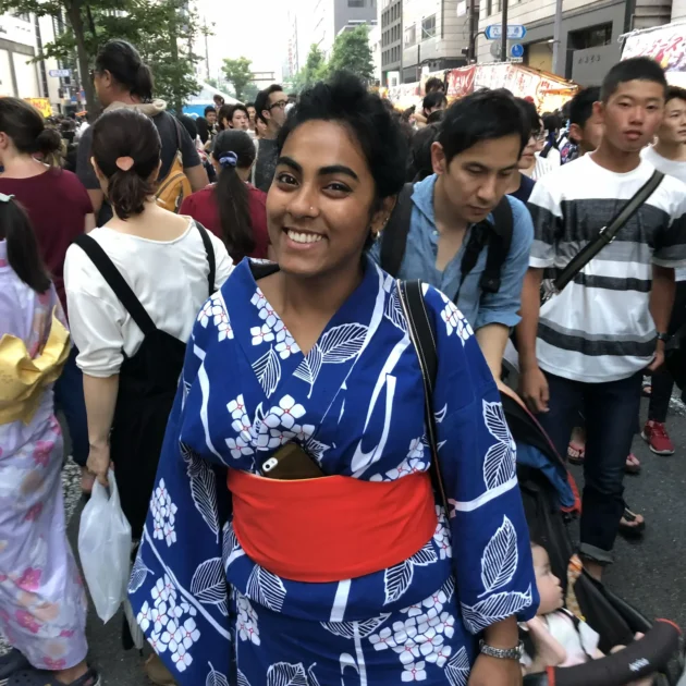
HIRISHA MEHTA, originally from India, is a Kyoto-based printmaker, typographer and a graphic designer, with a deep interest in type design, shapes and pattern design. With her unique approach to typography, she often combines elegantly reduced Japanese aesthetics and Indian traditions that result in creative design works.
インド出身のヒリシャ・メータは、京都を拠点とする版画家、タイポグラファー、グラフィックデザイナーであり、タイプデザイン、形状、パターンデザインに強い関心を持つ。彼女のユニークなタイポグラフィへのアプローチは、洗練された日本美学とインドの伝統を優雅に融合させ、創造的なデザイン作品を生み出している。